
Visual identity for The Rubbish Campaign.
Tearfund
Global Problem.
Global Solution.
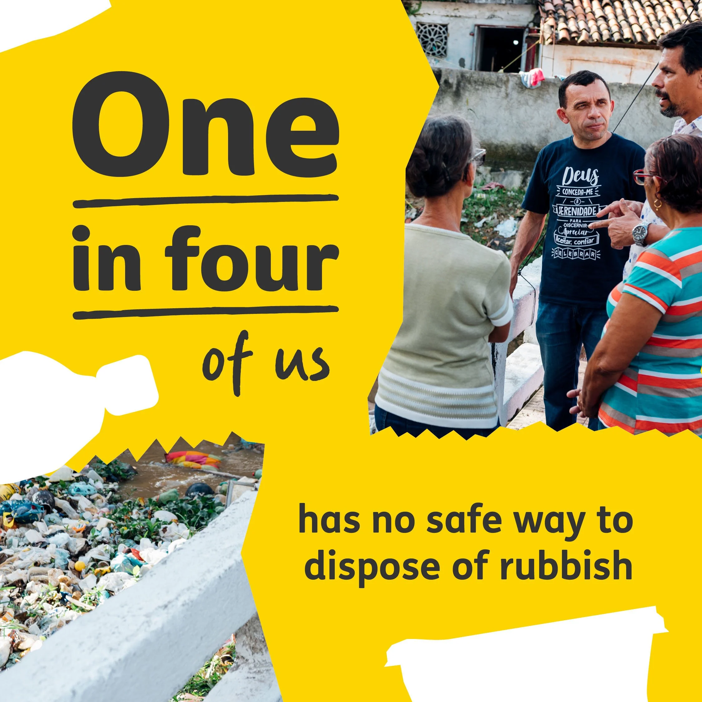
Over 2 billion people have no safe way to dispose of rubbish. This epidemic of plastic waste is causing rivers of pollution, flooding, and toxic fumes across the globe, and it’s those in poverty who are affected the most. To meet this vast challenge, Tearfund launched The Rubbish Campaign, a global initiative urging governments to develop the first-ever global plastic pollution treaty. I collaborated as part of an in-house team, to refresh and relaunch the campaign, creating a new look and identity.
Services
Campaign Identity
Social Media Assets
Presentation Slides
Brand Toolkit
Direct Mail

Photo: Steve Fanstone/Tearfund
Worldwide Action
Spread over six continents, the campaign’s identity needed to work across cultures and languages to spark audiences into action. The challenge was to create an arresting visual campaign, working within Tearfund’s brand guidelines, that would illuminate the true scale of the problem while supporting campaigners with assets and resources to bolster their advocacy.
Example of how the identity system adapts to different contexts.
Rubbish Design
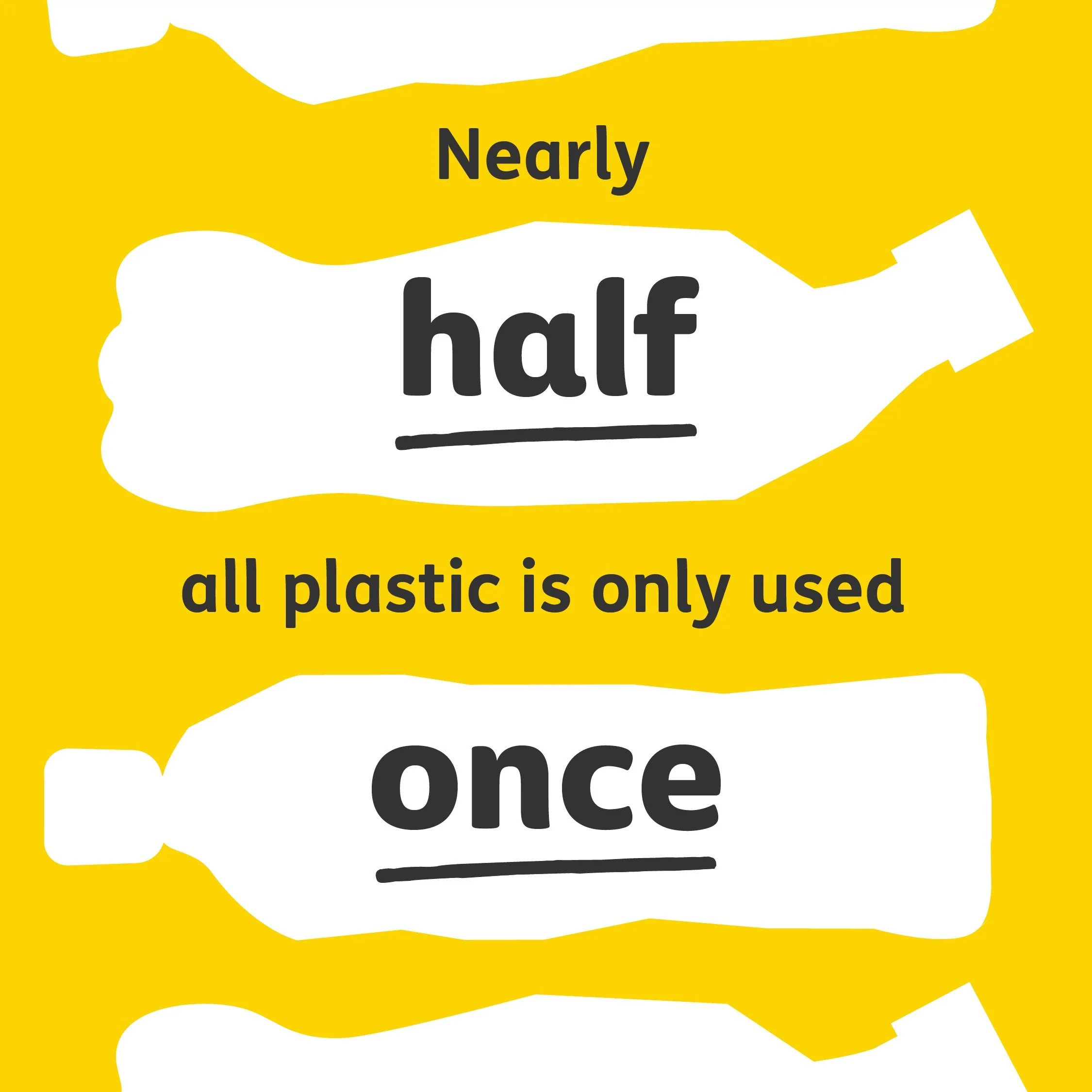
Using Tearfund’s yellow and grey as a warning, the campaign’s type system underlines the underlying ‘rubbish’ part of any message, creating an ironic, flexible identity that adapts to different contexts. While a pattern of oversized plastic illustrations visually bring to life the scale of the problem, with distorted shapes that ‘litter’ the communications to evoke the sense of overwhelming waste.

Social media post for The Rubbish Campaign stating, ‘Every minute the UK throws four double-decker busloads of plastic’
Social media post for The Rubbish Campaign stating, ‘Every minute the UK throws four double-decker busloads of plastic’


Sample of a presentation slidedeck produced for the campaign.

Working with Michael was a dream. He helped us refine what we actually needed, and developed a design style that brought together our disparate concepts and brands into a compelling visual narrative. Not only did he design all the elements we needed, but brought it to life with a meaningful, fun and simple concept that worked for all our audiences.
The results that Michael developed for us were such a success we worked with him to support the roll-out of his designs to partner organisations across three other continents with global success mobilizing audiences to respond. I look forward to being able to work with him again in the future!
Jack Wakefield | Senior Campaigns Manager, Tearfund
“
Explore more

The all-in-one broadcasting talkshow app ->
Visual Identity — UI Design

Igniting revival with a fresh rebrand ->
Branding — Digital Design — Print Design